Executive Summary
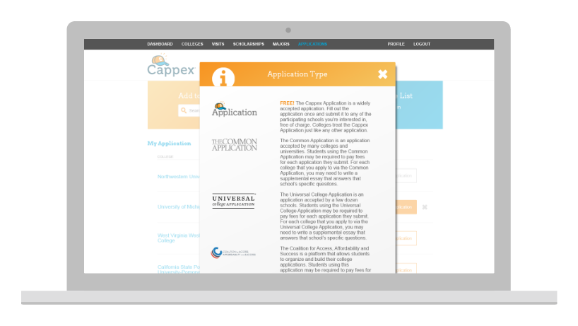
The My Application List project marked a pivotal advancement in the college application process, offering a centralized platform that significantly eased the complexities faced by students across the nation. This innovative tool enabled users to manage their college applications seamlessly, keep track of crucial admission deadlines, and select from a variety of application types, including The Common Application, Universal College Application, Coalition for College Application, and individual college's admissions websites.
Revolutionary Platform: Cappex's My College List became an essential service for students, simplifying the daunting task of college applications by centralizing the process.
Design and Usability Enhancements: Implementing a new design system alongside a vibrant Pop-Art color palette, informed by extensive user research, including focus groups and UI testing on the Cappex and College Greenlight platforms, led to a more engaging and user-friendly experience.
Widespread Adoption and Recognition: The platform's innovative approach to managing college applications has been widely acknowledged, with positive user feedback and increased platform engagement.
Project Information
Role: Sr. User Experience Designer, leading user research and managing a team of designers.
Team: UI Designer, UX Researcher, Web Designer, SVP of Product Management, Sr. Product Manager, Sr. Software Engineer, Sr. Software Engineer, Sr. Data Analyst.
Timeline: 6 weeks of research, 8 design sprints.
Status: Successfully implemented and operational, now evolved into Appily, a comprehensive platform for college choice.
Context
Cause: My Application List was initiated to simplify the management of multiple college applications and admission schedules.
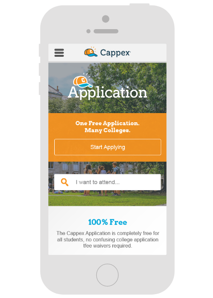
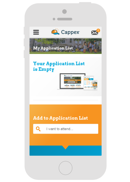
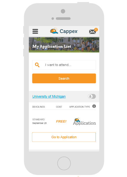
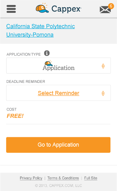
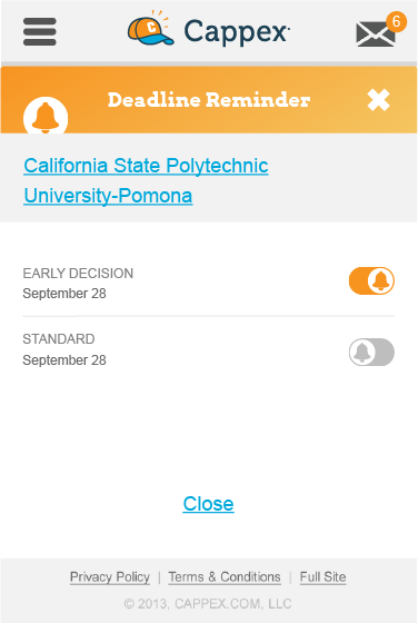
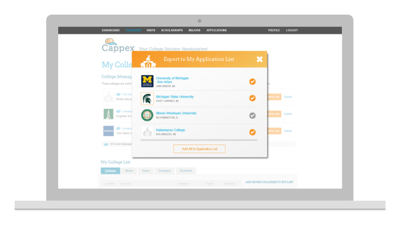
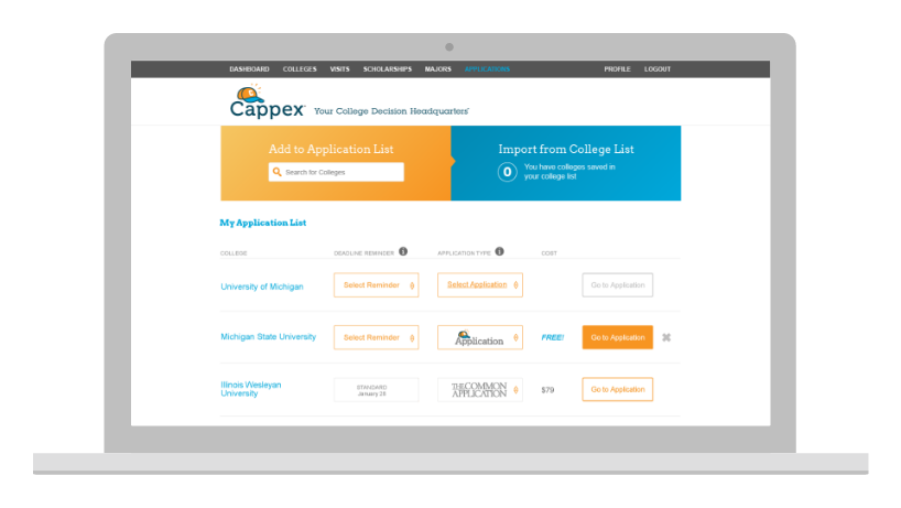
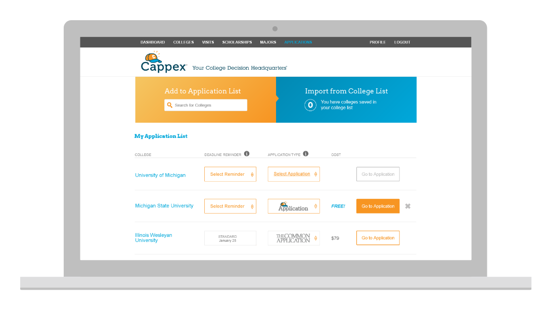
Environment: Expand on the current College list. Add functionality for application type, admissions calendars, and set reminders. The platform was designed with high school students in mind, aiming to streamline their college application process while identifying scholarship opportunities.
Problem: Students are burdened with managing and tracking each school's admission calendar of deadlines. There was no clear, centralized solution where students could address all their college applications in one place.
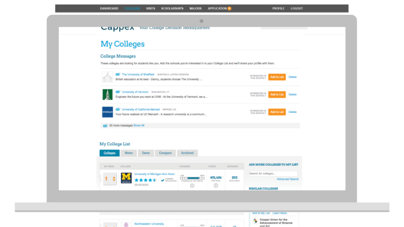
Legacy Cappex Dashboard AKA My College List
Research
Insights: Research conducted through focus groups and UI testing on the Cappex and College Greenlight platforms underscored the demand for a streamlined tool for application management.
User Flows: The user journey was broken into four disciplines:
• Import from Legacy College List
• On-boarding
• Adding Colleges
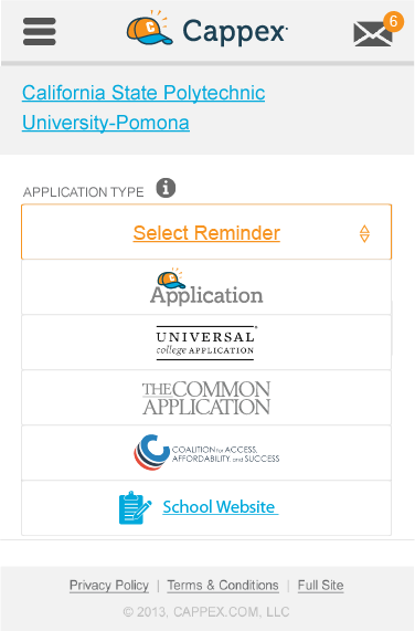
• Application Type Sections: Universal Application, Common Application, School Website, and future Cappex Application.
• On-boarding
• Adding Colleges
• Application Type Sections: Universal Application, Common Application, School Website, and future Cappex Application.
Issues: User were left without updates after submitting their application. The college needed to communicate with students via Cappex. Users want more transparency in the application process, including updates like: "Applications Received," "Application in Review," "Applications Denied," and "Accepted!".
Design
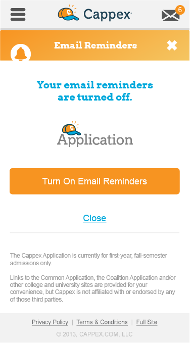
Flows: Replace the existing My Colleges list. Create a new location within the website navigation for the college inbox where colleges can contact students. Encouraging students to be aware of the admissions schedule for each college they add to their list. Also, allow students to turn on email notifications for application due dates and other admission deadlines. The platform should provide students with a seamless experience in managing their college applications.
Interactions: A minimalistic approach was taken, enhanced by a lively Pop-Art color palette to make the platform not only user-friendly but also visually appealing.
Visuals: The design system was influenced by direct user feedback and testing, ensuring an engaging and functional interface.
Test
Prototypes: We refined the interface and functionality through various prototyping stages. In the first round, we focused on usability and user awareness. Once we were confident in the user experience, we tested new branding approaches. Ultimately, we settled on a colorful yet simplistic design.
User Tests: I initially believed the students would want a more grown-up feel to the color pallet and move away from childish or juvenile bold colors. Multivariate testing proved me wrong.
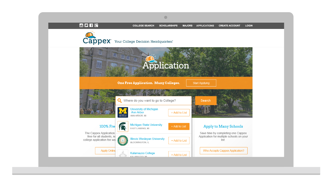
MVPs: My Application List was created as a minimum viable product to validate the concept of Cappex Branded College Application.
Results
Final Designs: A user-friendly platform integrating The Common Application, Universal College Application, Coalition for College Application, and individual college admissions websites.
Outcomes: My Application List was placed by guidance counselors, students, and parents. The need to better guide students through college admission has long been clouted with confusion and chaos. Our product received positive feedback for its improved user experience and increased engagement while searching for prospective colleges.
Takeaways
Learnings: The project underscored the importance of user-centric design, iterative development, and the value of challenging initial assumptions through testing.
Reflection: Feedback and engagement metrics validated the project's success, highlighting the impact of design choices on user experience.
Social Proof
Testimonials: Cappex’s inquiry to the application was as high as 47%, with 8.5% of those students going on to enroll and 90% of users discovering at least one new college.
